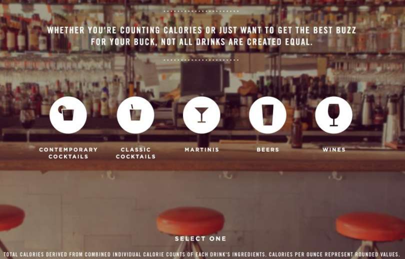
I love to look at design inspiration outside of the eLearning box. From web design to flyers and posters to infographics, different design fields can have a lot to teach us. One of my favorite interactions to go back to is the Enlightened Happy Hour interactive infographic by Column Five. (They fixed the site and the infographic is working again. YAY!!)

I love everything about the design of this piece but I was especially inspired by the video intro and the way they highlighted the drink from the background. I also liked that each drink got its own page of information yet all of the categories of drinks were easily accessible without having to return to the front page. I also just plain like the big beautiful images. One of the lessons learned from an interaction like this is in simplicity. It doesn’t include step-by-step instructions on how to use it. It uses text sparingly and with great effect. Sometimes, I think in trying to reach a broad audience, we underestimate the user and cause ourselves great, big design headache by trying to fit 500 words of text on something that should be simple, clean, and beautiful.