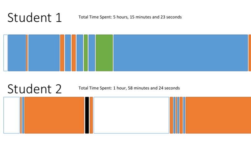
I’m currently working on a project seeking to transform click stream data taken from a pilot course into a story of student paths through the course. It’s my first real data viz. It’s been a bit of a struggle so far but I think I’m on the right track. The function of the project is to create that story of user paths, allowing our audience to explore the individual path of a student, and compare student paths. The other kicker is the desire to create the visualization in such a way that subsequent data can use the same template (so, no hand-drawn data viz here; I needed something systematic). The last feature is that we wanted to represent the actual course asset accessed in an xAPI author-action-object type statement. Of course, thinking about this project as an interactive data visualization, I first turned my sights to D3 JS.
D3 JS
D3 is a JavaScript library specifically for creating data visualizations. While there are a ton of examples to pull from, and I did manage to hack together a stacked bar chart, I found that, with my current level of JavaScript understanding at least, D3 is too complex to try and learn and use quickly. It’s definitely on the list but it’s something that will take some time to understand. The other big issue that I ran into while trying to create the interactive versions is trying to find a viz that works when using a systematic tool like D3. I began the project by looking over various charts and graphs from D3, taking a good look at Stephanie Evergreen’s awesome site, and revisiting the amazing Ann Emery’s Chart Choosing Tool. I created a lookbook in PowerPoint and then, after a few good walks around my building, I then created some mockups. I settled on the stacked bar chart as the best choice. It makes it the data easy to interpret and allows anyone to see the difference between user journeys at a glance.

However, when trying to actually use a stacked bar chart, the problem is that each column is discrete and can’t be repeated. So I couldn’t represent that a student viewed a page, then watched a video, then viewed a page again. All page views would be clustered together. What’s a designer to do?
Google Charts to the Rescue
I talked it over with my boss, and he suggested trying Google Charts. Right off the bat, I found Google Charts much easier to use. The inline version of the timeline chart proved to be the best option. By default, the chart colors all data with the same title the same, making it easy to group event types by color. However, given the data I have, which includes start time for different course events, I could also plot those activities accurately; allowing for that scenario of viewed a page, watched a video, viewed a page. Included tooltip functionality made it easy to create tooltips on hover that showed the xAPI-like statement for each event.

Future Functionality
My new objective is to see if I can extend my simple example to be filtered to compare two students together and to zoom in an out to let people see the slim bits more clearly. It seems like this should be possible but I can’t find anything in the documentation. I think I can figure it out with a little grit. Any data viz in your past or future? How would you visualize a user journey using a template?