A couple of weeks ago, my really awesome colleague Mike (hi Mike!) introduced me to Oppia, a new free and open-source tool dedicated to helping people create interactive conversations. After talking with one of the maintainers of the project, Sean Lip, I’ve been able to jump on board the project with parallel goals: I’ll be contributing to the codebase on front-end projects using Angular (I am SOOOO excited) and I’ll be exploring the tool from a learning experience standpoint. Here’s me diving in to the tool as a user. In the spirit of tying this project to my day job, I decided to use Oppia as an opportunity to provide an alternative experience for the content creation framework Mike (the colleague I mentioned before) made. We’ve been inspired by our current project to explore ways that we can introduce faculty to learning experience design and hopefully, inspire a move away from the unfortunate hammer approach that has invaded most online courses: video, video, video… with maybe some practice questions and discussion forums mixed in there. Our idea is that by presenting the framework with all of the different content options, we can get out in front of the idea that video is the one-stop-shop for everything and instead inspire thoughtful content and design decisions. So I decided to use Oppia to create an interactive conversation. When I say interactive conversation, I want you think Jellyvision or these great demos from an Articulate challenge, except open-source and without audio or animations. So it’s definitely pared down, but I still think the tool is a great idea.
The Awesomeness
If you just dive in, the tool is actually pretty intuitive. So, as a user (albeit familiar with other elearning tools) I found it was easy to use.

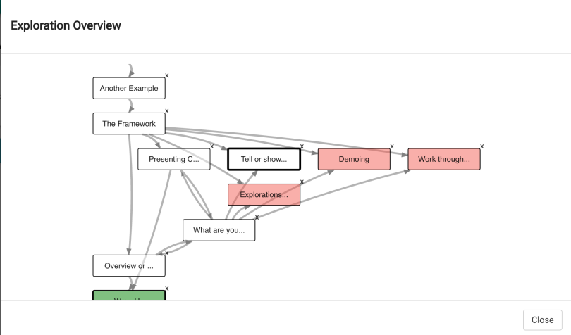
I really like that I was able to continuously test the interaction before publishing. That, along with the warnings given on the exploration (that’s their term for the interactions you make using their tool) map let me know when missing options might cause a problem. It reminded me of Twine in that respect and was super helpful.

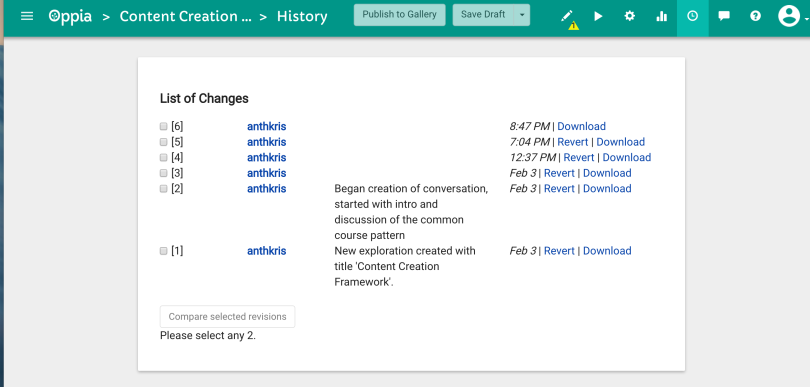
Another great feature is the history. They tool inspiration from tools like github and google docs where you save drafts of your interaction (you can even put in brief messages with each save to help you remember what you changed). This means that if you or a collaborator completely FUBAR the interaction, you can easily roll back to a previous version (providing you saved one, of course).

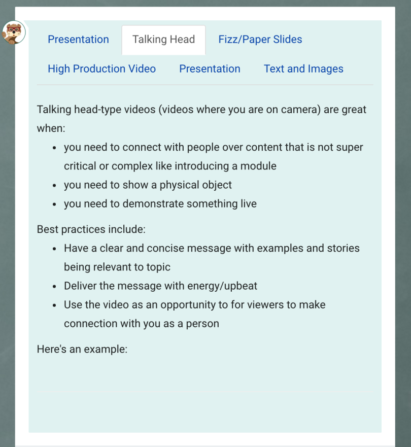
As far as the creation tool set goes, it comes with some great built ins to demo programming and math, which are super hard to come by in other tools. Tabs and accordions are also built in and easy to use.
Some Other Observations
There is an introductory conversation that is set up currently but after an outdated video (the project is updating rapidly) it goes into information about finite state machines. For my part, while that technical might be interesting to some people, a better introduction would concentrate on how to use the tool and where it might fit in various instructional contexts. I’d like to see it be a prominent part of the first time user experience (at least as an option) in addition to the other nudges they provide. They have some suggestions about making an effective exploration but it’s hidden away in a link in the about page, which itself is hidden in a hamburger menu. This is the sort of thing that should be front and center for a new user. They could also use a short sizzle reel to provide the what’s in it for me inspiration for people who want to know why they should jump in. But that’s marketing stuff. I also noticed a couple of bugs:
- Firstly, with the tab content, you can’t see videos that you put in. Another thing was that, when I went to put in tab content to a different card, the same tab content showed up again, instead of being cleared.
- Accordion content allowed for videos, but in display, it showed up squished as opposed to taking up the full length of the conversation bubble if you didn’t have starter text to stretch out the bubble. Even then the text was there, videos broke the content box in accordions, due to some styling issues.
- Long links also broke the content box instead of wrapping.
- Paragraphs weren’t spaced well so I had to put an extra line between paragraphs to make text more legible.

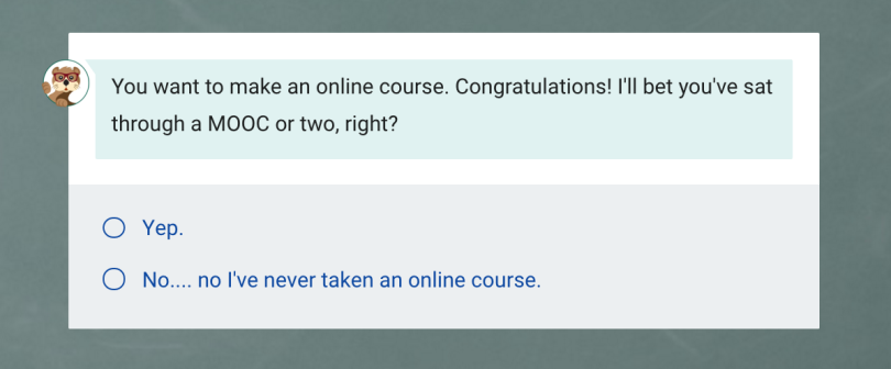
Not deal breakers but things that should be fixed. Also, as I sought to playtest my interaction(which I did very often), I’d love the option to start at the current card, instead of having to playtest the interaction from the beginning every time. Another really tiny detail, is that I think it would be best to be able to upload an avatar for the conversation. Right now, everyone is the cute Oppia otter. I think it would add to the conversation idea to have (a slightly bigger) avatar of a real person (your instructor or TA or whoever is appropriate) as the person you’re talking to. Check it! Here’s my attempt at an Oppia interaction. Let me know what you think!
