My first project at my new job has been to visualize student journeys through some elearning courses that we’re supporting. After a bit of struggle finding a framework that I could get started with, I choose Google Charts. As we expanded on the desired features of the visualization, I began to struggle a bit more with getting things to work. But grit, determination, and some super helpful people on Stack Overflow and the Google Visualization group helped me get where I was going. Here’s the scoop. After initial prototyping and discussing features to include with my supervisor, I took a three-pronged approach to this task:
- Get it to work
- Create some controls
- Allow for viz to be updated with data
Phase I: Get it to Work
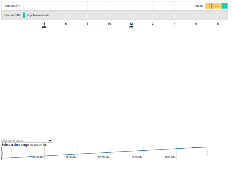
When I first started the project, I came in with the assumption that I should use D3 JS. But, still being a JavaScript newbie, I saw pretty quickly that I would need to be a lot more comfortable with the language before I could create something using that library. My boss threw out a couple of other possibilities: Google Charts, Processing JS, etc. I looked into Google Charts, which had a timeline chart as a part of the API. This was perfect as it was meant to handle dates and repeat labels. So I jumped in. As is the way with initial programming, I began by just wanting to get a native example in Google Charts to work. This was wonderfully easy. The documentation for the basic charts is excellent. I used the timeline with the native data table and got a working prototype in quick order. The only (sorta) advanced thing I did at this stage was to make the tooltips HTML so as to be able to display the xAPI-like actor-action-object triplet.

Phase II: Create some Controls
As I was creating the basic prototype, I came across the information on controls and dashboards. They allow for more interactivity and sorting of a chart. And after putting in the information, I saw that the duration for many of the actions was too small for people to see. So I wanted a way for people to zoom into the visualization and look at each event more closely. It took a bit of Googling, but I found a Google groups discussion that set me on my way. After a bit of hacking, I was able to create the dashboard. The problems began, though, when I actually tried to use it. I consistently received a “participants failed to draw” error. I asked the super helpful folks on Stack Overflow and the Google viz group, and implemented a solution that stops the chart from redrawing when there is no data.
- Stack overflow: Google Chart Timeline Participants Failed to Draw
- Google Groups: Tooltip Error issue on Timeline Chart
//Defined a new chart type; Prevents redraw when there is nothing to redraw
 //prevents participants failed to draw error
 window.NoEmptyTimeline = function(container) {
 this.chart = new google.visualization.Timeline(container);
 var me = this;
 google.visualization.events.addListener(this.chart, 'ready', function() {
 var args = Array.prototype.slice(arguments);
 google.visualization.events.trigger(me, 'ready', arguments[0]);
 });
 google.visualization.events.addListener(this.chart, 'error', function() {
 google.visualization.events.trigger(me, 'error', arguments[0]);
 });
 };

 NoEmptyTimeline.prototype.draw = function(data, options, state) {
 if (data.getNumberOfRows() > 0) {
 this.chart.draw(data, options, state);
 }
 };
[more code]
var chart = new google.visualization.ChartWrapper({
 'chartType': 'NoEmptyTimeline',
 'containerId': 'chart',
 'options': {
 'width': 985,
 'height': 600,
 'chartArea': {
 width: '100%',
 height: '80%'
 },

 'title': 'LeaP Student Data for Biology Course',
 'tooltip': {
 isHtml: true
 }
 },
 'view': {
 'columns': [0, 1, 2, 3, 4, 5]
 }

 });
After that, I thought it would also be a great idea to be able to choose a group of students out of the whole group to compare to each other. So I implemented a second dashboard control, the category filter. The tough part about this was, initially, only one of the controls would display. But after a couple of hours hacking away at it, I found out that I needed to make separate divs in which to display each control, and that both of those should be situated inside of the dashboard div.
//Create a range filter to allow for zooming in
 var rangeControl = new google.visualization.ControlWrapper({
 'controlType': 'ChartRangeFilter',
 'containerId': 'time_control',
 'options': {
 'filterColumnIndex': 4,
 'ui': {

 // SET MIN RANGE- Legacy fix for participants failed to draw error
 //Stops slider from going too small
 //'minRangeSize': (60 * 60 * 1000),

 'chartType': 'TimeLine',
 'chartOptions': {
 'width': 900,
 'height': 70,
 'chartArea': {
 width: '100%',
 height: '80%'
 },
 'hAxis': {
 'baselineColor': 'none'
 }
 },
 'chartView': {
 'columns': [4, 5]
 }
 }
 },
 });

 //Creates category filter so people can lookup and compare particular students
 var studentFilter = new google.visualization.ControlWrapper({
 'controlType': 'CategoryFilter',
 'containerId': 'student_filter',
 'options': {
 'filterColumnIndex': 0
 }
 });
[some more code]
dashboard.bind(rangeControl, chart);
dashboard.bind(studentFilter, chart);
Phase III: Bring in the CSV
The last phase of the project was the most challenging, but made a lot of sense. We wanted to be able to update the viz using data imported from a CSV file. This external data source would mean that anyone (read non-programmers) could add data to the chart and it would update. Definitely a worthwhile feature and on that was very difficult to implement. After some more Googling, I found a jQuery plugin that was supposed to help with this. Perhaps it worked, perhaps it didn’t but what it definitely couldn’t do was parse datetime data, an essential part of the timeline viz. Another post to the Google group confirmed this and the super knowledgeable Sergey suggested that I use the native queries to get the data. Again, this took many, many tries to implement successfully. The biggest thing I had to overcome was actually accessing the CSV. Since I didn’t have a local server, I was running up against a cross-origin request issue. Essentially, the query wasn’t allowed to access my the CSV unless both the HTML page and the CSV were hosted on the same server. Took forever to figure this out, but I hosted both files in my dropbox and got around it. I also wanted to put as much as possible into the CSV file, including the tooltip and the column color data that I had previously put in the native data table format. Initially, the program only wanted to accept the normal, documented columns from the CSV: the row and column labels and the start and end date. More hours of Googling later, I found out that I could get around this by using the setColumnProperty property to define the tooltip and the style columns.
var data = response.getDataTable();
 //Sets roles of columns to allow them to be in the CSV file
 data.setColumnProperty(2, 'role','tooltip');
 data.setColumnProperty(3, 'role','style');
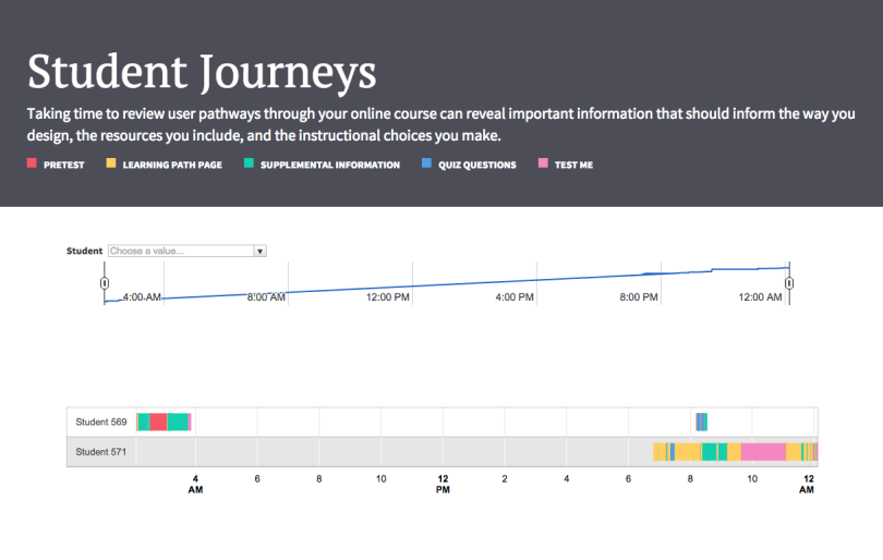
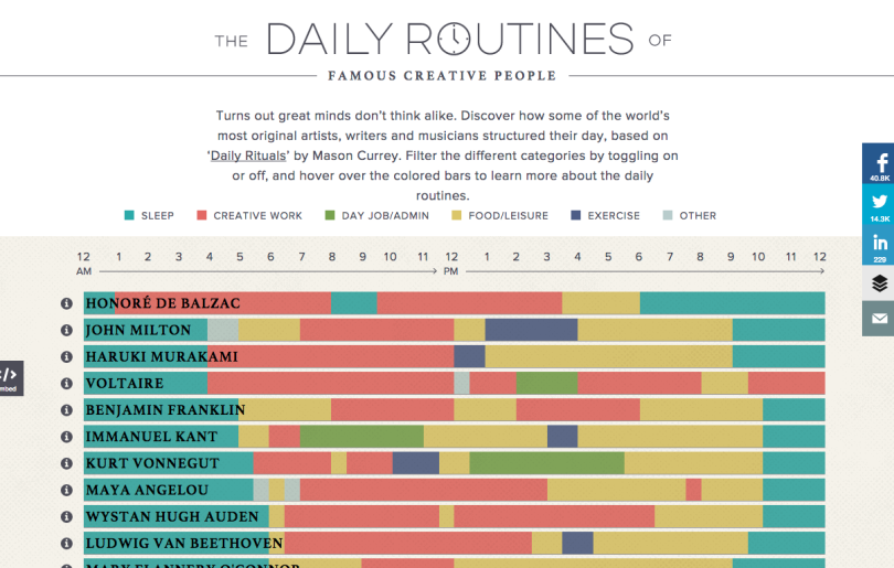
So, after I got everything working, I decided to add a little flair. Taking my queue from the beautiful Daily Routines of Famous Creative People site, I used an initializer Bootstrap template to style my third iteration. It isn’t perfect. There’s too much white space between the timeline and the controls. But it is (clunkily) responsive. So that’s a win!


Thoughts and Next Steps
On the whole, I think the viz works. I think it does a good job of visualizing journeys and pathways through the course. The design is a little clunkier than I’d like. I’m sure D3 would give me more flexibility in styling things, so I want to take some of the courses I’ve found to learn more about it. Also, as much as I think the CSV is a good idea, there’s still a substantial amount of human labor that will have to go into translating the clickstream data we get into a human-readable format. Things like writing the tooltips and mapping event type, mastery type, and content identifiers to their actual meanings mean that there’s still a need for someone to be present in this project. So my boss suggested that I try to use excel functions to automate this a little more. Never used those before but I’ll give it a whirl… Any thoughts or suggestions, folks?