This week, I worked to ship an as yet imperfect version of my July GDS Challenge, an accessibility playbook for elearning. When I began this project, I was considering creating another course video on creating a proper skipnav link. I may still do that but, as I grow in my javascript learning, I find myself wanting to create more side projects at the intersection of elearning and programming. I though this was a great opportunity for that. So I pivoted and, with inspiration from the U.S. Digital Services Playbook, I decided to take a stab at creating a responsive one-page site from scratch.
Content
I settled on an accessibility playbook, based on the lessons I’ve learned so far, part 1 here and part 2 here. I thought that it would be a great project to serve as inspiration for something that I might present at an organization. I also thought it would be a great opportunity to invite the elearning community to contribute and provide new “plays” so as to share knowledge about really implementing accessible/universal design in what we do. On that note, please be sure to submit any issues (things that don’t work, new plays, etc.) to the github repo. I’d love to have this become a multiple contributor project.
Prototyping
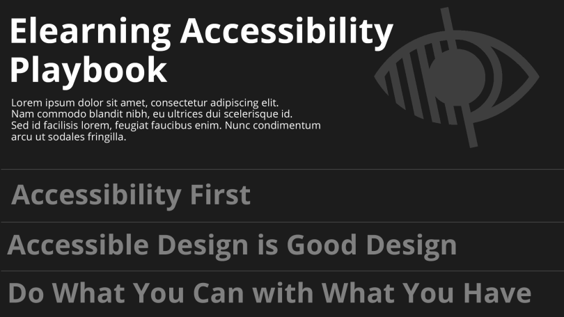
I began by creating a mockup in Photoshop. As I’ve written before, I’m finding quite a lot of carryover in design methodologies between web development and elearning development. This was no exception. I love to look at One Page Love for design inspiration and I loved the simplicity of this portfolio site of Diogo Akio. So I decided to emulate that, while still making the site a one-pager.

Programming
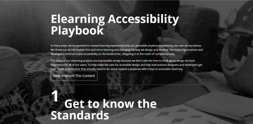
I began with a HTML5 responsive boilerplate from Initializr. After getting rid of the initial styles, I began to put my prototype into play. I tried to use two important concepts that I mention in the playbook: progressive enhancement and accessibility first. So I built the site using CSS and HTML first and added a bit of jQuery to smooth the scroll transitions and handle the change the background images on hover. I was torn between multi-page and a one-page design at first. But I decided to go ahead with a single page design. I also wanted to implement a bit of interest with some non-rectangular background shapes. I used a tutorial from codrops with mixed success. It works pretty well.
Current Issues
I tested in on my iPad and iPhone and, on the whole, it works fine. Two issues I’ve identified are that one of the unicode characters I’m using as bullet points isn’t working (which reminded me of this super interesting article on why icon fonts aren’t good for accessibility) and some of the kerning and spacing needs some adjustment. I hope to get those taken care of this week.
Take a Look
I also took the opportunity to work more with Github for this project and created a new repo. Check it out: http://anthkris.github.io/Accessible-Playbook/
